Difference between revisions of "FOSS4G 2011 Logo"
Wiki-Ebwolf (talk | contribs) |
Wiki-Ebwolf (talk | contribs) |
||
| Line 8: | Line 8: | ||
Image:Logo 2008.png|FOSS4G 2008 | Image:Logo 2008.png|FOSS4G 2008 | ||
Image:Logo 2007.png|FOSS4G 2007 | Image:Logo 2007.png|FOSS4G 2007 | ||
| − | |||
</gallery> | </gallery> | ||
Revision as of 21:26, 18 October 2010
Prior FOSS4G Logos
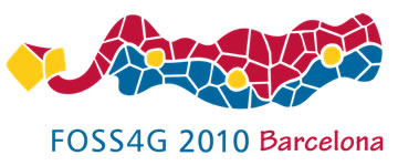
FOSS4G 2010

FOSS4G 2009

FOSS4G 2008

FOSS4G 2007


Logo Concepts
NOTE: These are all concepts... the final idea may be reworked by a real graphic designer!
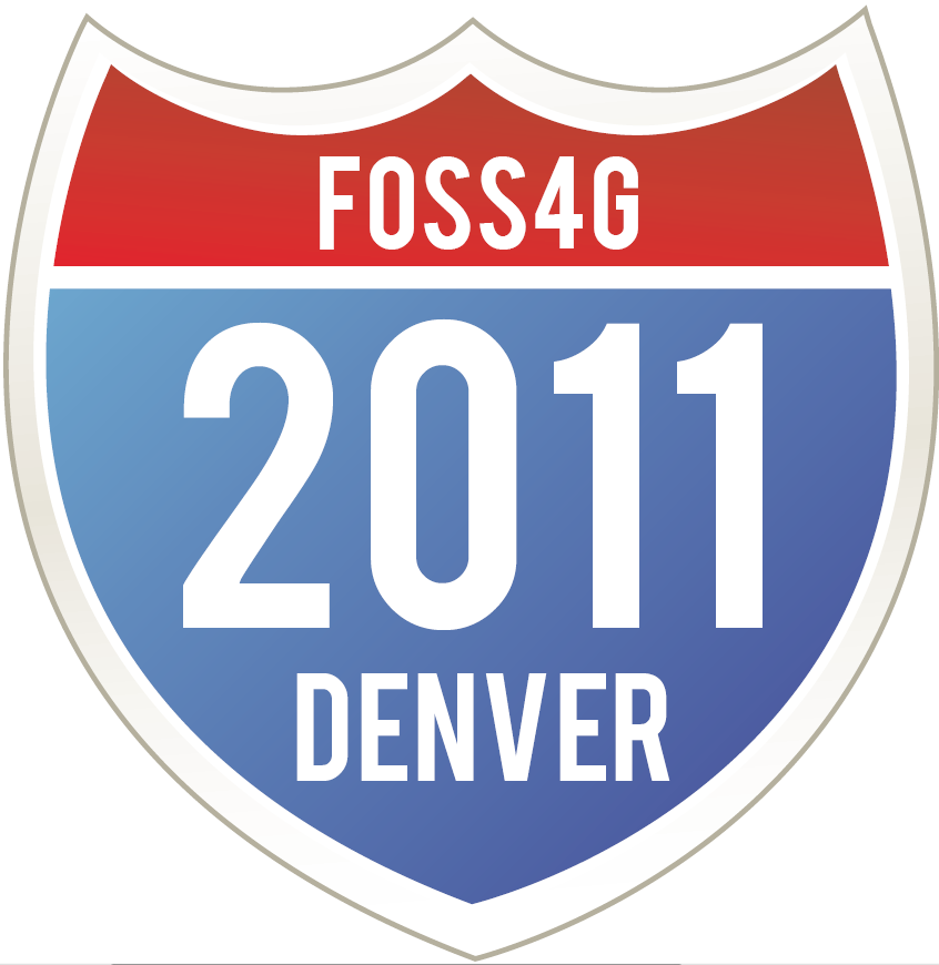
Highway Shield
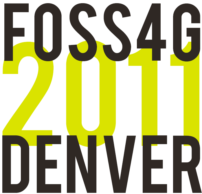
Stacked Logo
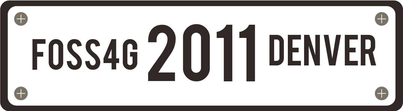
Euro Plate
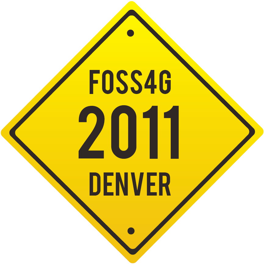
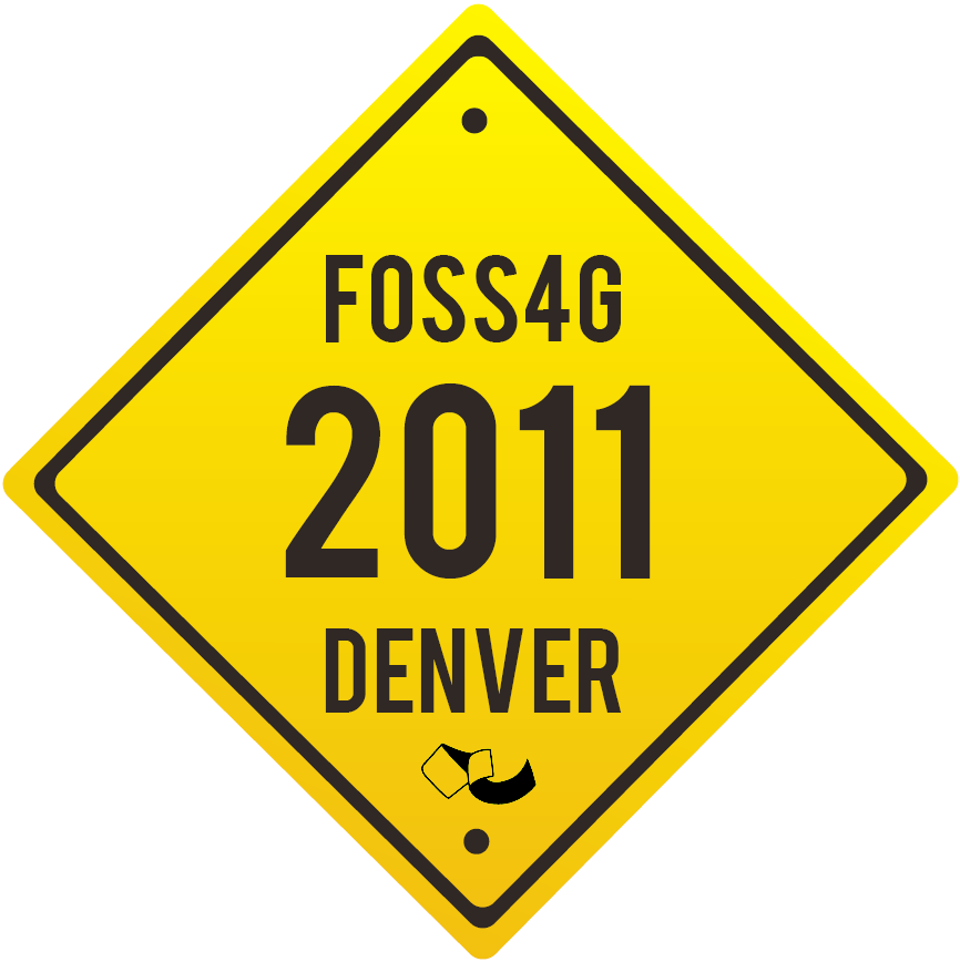
Yield Sign Logo

Concept 1

Concept 2
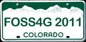
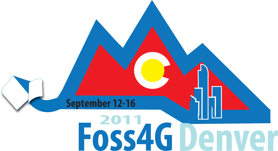
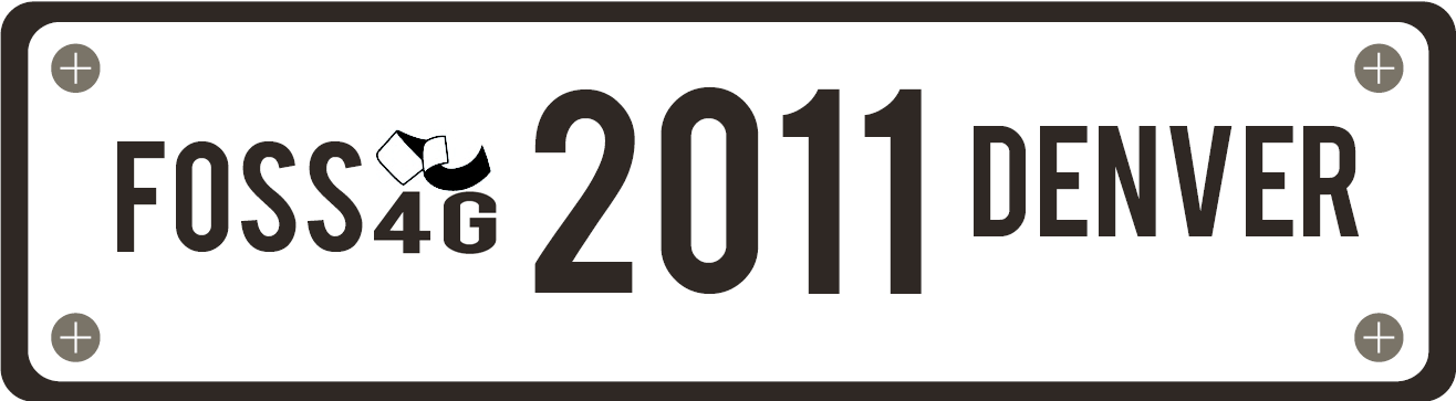
Colorado License Plate
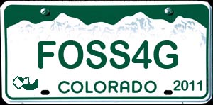
Colorado License Plate w/ Ribbon

Concept-All Blue
Concept-Colorado

Concept-Colored Skyline
Concept-Filled Mountains
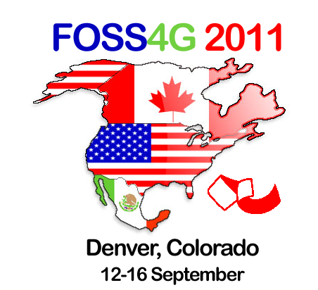
Busy NA Concept
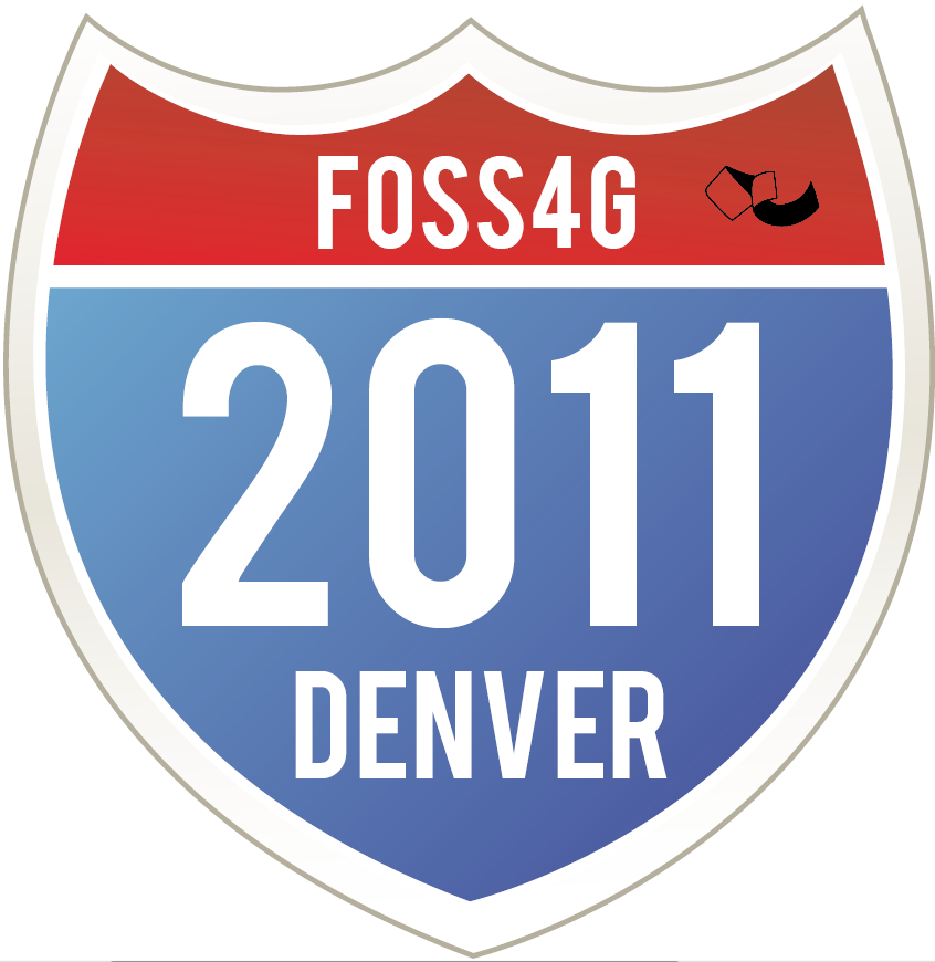
Interstate Shield w/ Ribbon
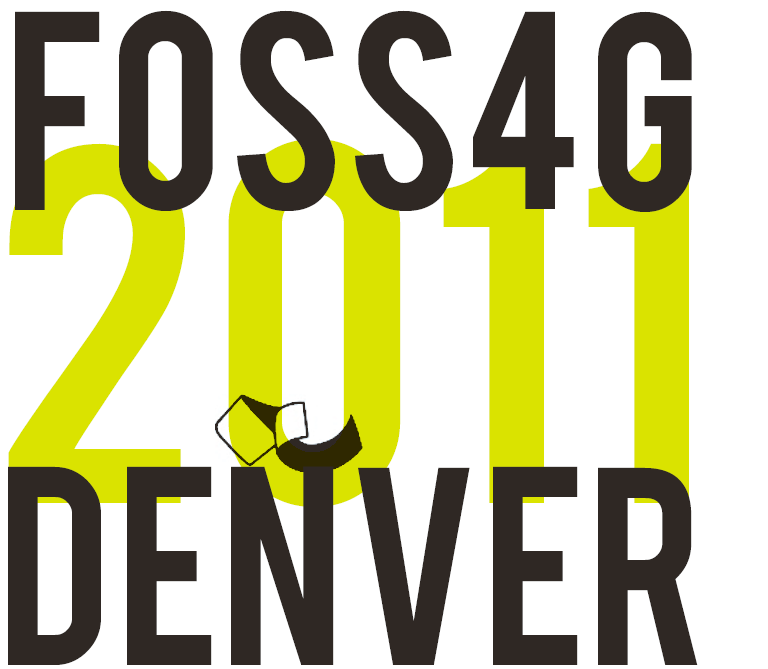
Stack w/ Ribbon
Euro Plate w/ Ribbon
Yield w/ Ribbon

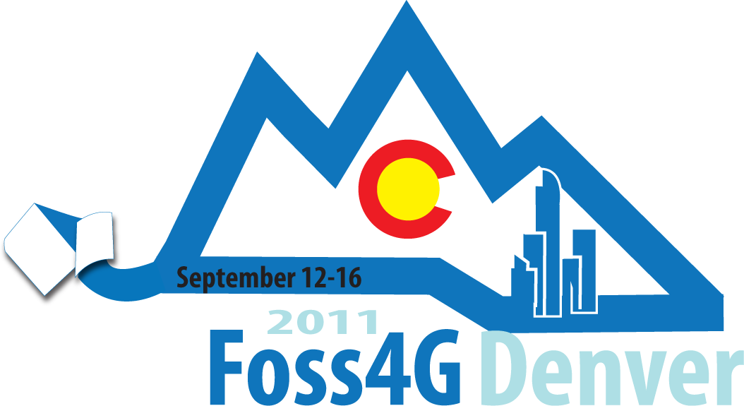
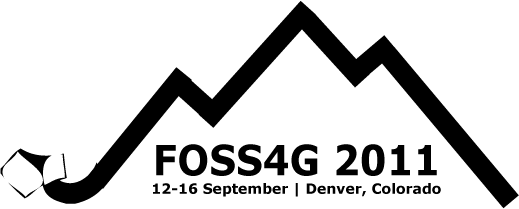
FOSS4G goes to 11
Basic Mountains


Please add your comments here!
From Peter: Personally I like the idea of something that is similar to the Sydney and Cape Town logos, which incorporate the ribbon as a more central theme, and depict the Rocky Mountains across the top. You can see these logos [here]. The GITA design is along these lines, but personally I'd like to see a few more options on that idea, perhaps from Steve's designer to get some variety. I like the Sydney logo best, I prefer its simplicity and would vote for something similar in terms of the text.
I think we also need to consider how the logo appears to an international audience. For example the Colorado license plate is a nice looking logo is many ways, but probably its significance wouldn't be too obvious to people who aren't from here. Some of the others may fall into that category too (don't know whether the Interstate one is included in that or not?)
OSgeo Ribbon

Note: The final logos must have the OSgeo Ribbon integrated
Original Files
Concept1 (opens in Google Docs)
Concept2 (opens in Google Docs)
Ribbon Concept 3 (opens in Google Docs)
SteveC's ideas: File:SteveC-Logo.pdf