Difference between revisions of "FOSS4G SotM Oceania 2019/Logo Entries"
Wiki-Dwsilk (talk | contribs) (Added Tim's description) |
Wiki-Dwsilk (talk | contribs) (Added Pete's kiwifruit logo description) |
||
| Line 45: | Line 45: | ||
File:korufruit_square.png|Variant | File:korufruit_square.png|Variant | ||
</gallery> | </gallery> | ||
| + | |||
| + | Whilst FOSS4G and State of the Map may not be a great source of antioxidants, Vitamin C or dietary fibre, it is the healthy choice. | ||
-- Entry by [https://wiki.osgeo.org/wiki/User:PeteKing Pete King], 10:33, 3 Mar 2019 (UTC) | -- Entry by [https://wiki.osgeo.org/wiki/User:PeteKing Pete King], 10:33, 3 Mar 2019 (UTC) | ||
Revision as of 18:40, 10 March 2019
2019 Logo Entries
For details on the contest, please go to the contest page.
Entries to be added below in the same format as the example:
Example Winning Entry from 2018 ('Globe Globe' by Pete King)
-- Entry by Pete King, 8:48, 8 Feb 2018 (UTC)
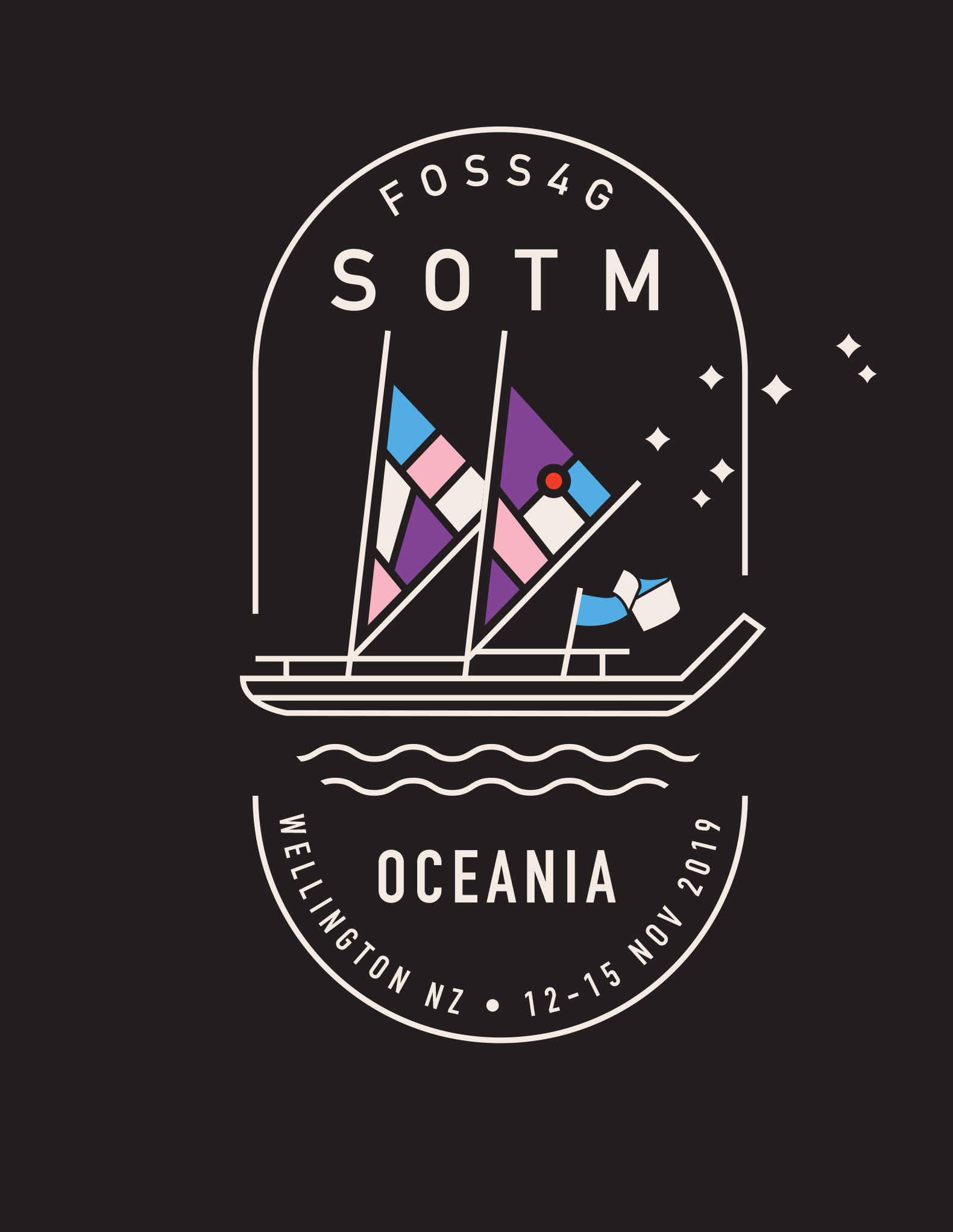
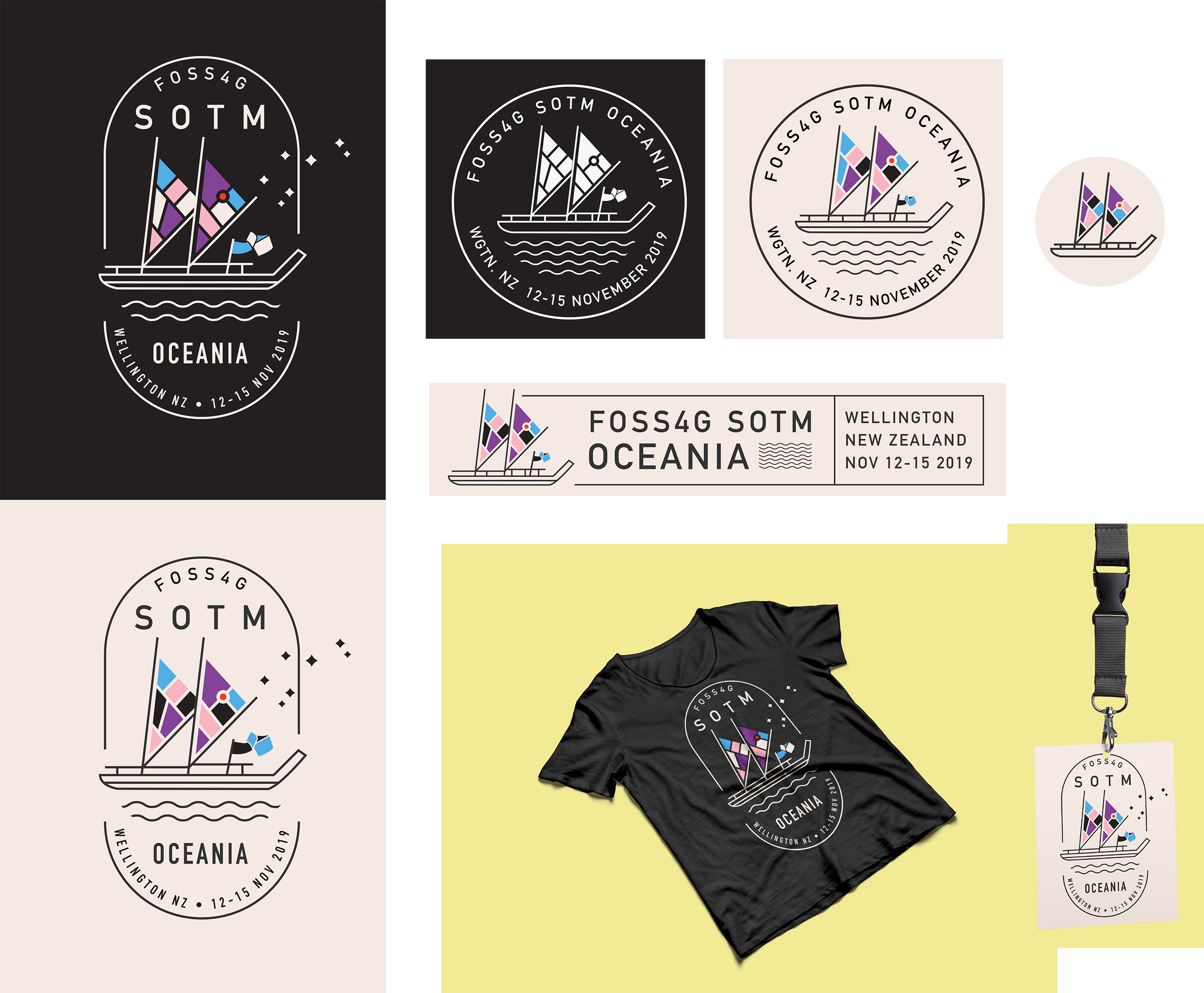
Logo Submission by Tim Denee
The main feature of the logo is an ocean waka beneath a constellation of stars (Matariki), referencing indigenous people across Oceania (Pasifika and, of course, Māori) and their traditional mastery of complex navigation. It's linking one of the oldest forms of communal spatial reference to the geographic region where this conference is taking place. This connection between old and new is reinforced by the design of the waka sails, which are intended to echo abstracted city maps - city blocks and streets. Finally, the FOSS4G ribbon flies proudly from the waka itself.
-- Entry by Tim Denee, 8:21, 25 Feb 2019 (UTC)
Logo Submission by Adam Steer
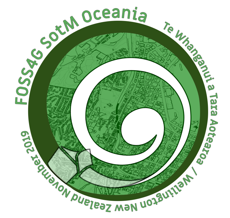
This design is inspired by the Koru, a Maori symbol of strength, growth, nurturing and hope, drawn in turn from the characteristic shape of an unfurling fern frond. The motif of a spiral, or circles-within-circles, is also common to all the cultures of Oceania, meaning variously 'meeting place', or 'journey/passage' and more. The green colour scheme is a direct nod to greenstone/pounamu used for tools and jewellery by Maori; with an OpenStreetMap-based map of wellington etched into the surface. The OSGeo ribbon sits at the start/end of the spiral/journey, marking a place of transition and change. A generally accepted Maori name for the conference location is given prominence, in lieu of the exact dates.
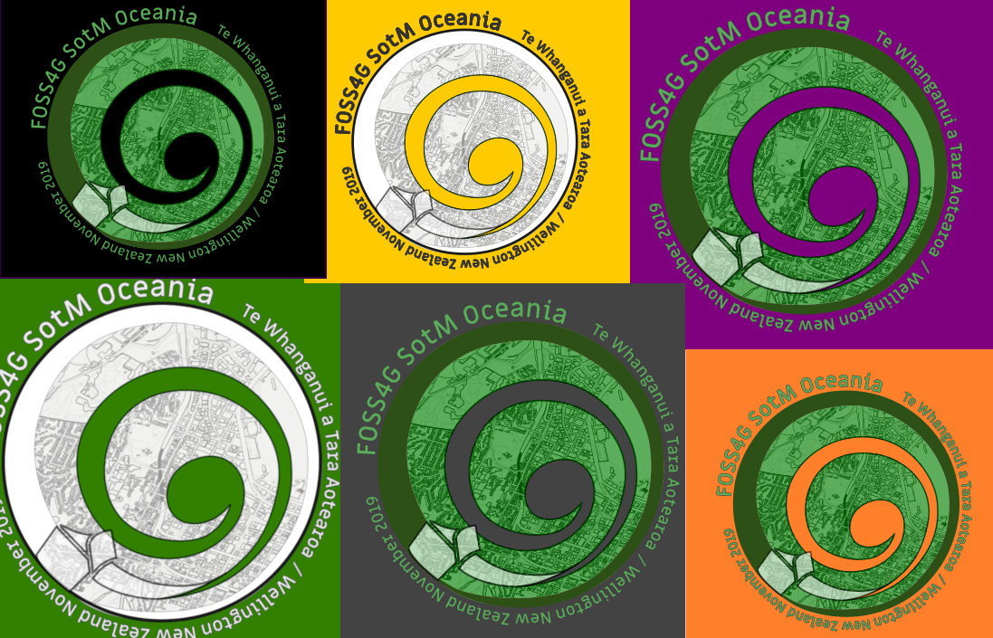
It uses tints of green, meaning the design can be printed in two colours. It is also readily adaptable for different layouts (hexagon, text unrolled to the left or right or above or below). The map is also easily replaceable, enabling focus on different locations.
-- Entry by Adam Steer, 5:24, 26 Feb 2019 (UTC)
Logo Submission by Pete King
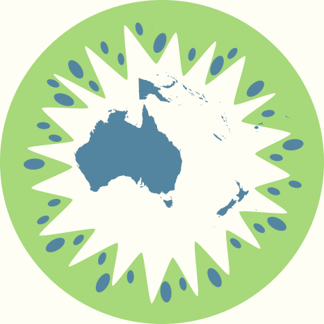
Whilst FOSS4G and State of the Map may not be a great source of antioxidants, Vitamin C or dietary fibre, it is the healthy choice.
-- Entry by Pete King, 10:33, 3 Mar 2019 (UTC)
Logo Submission by Rory McPherson
Design inspired by Wellington's infamous Hollywood-style 'Wellington Blown Away' sign in Miramar.
-- Entry by Rory McPherson, 06:48, 7 Mar 2019 (UTC)
Logo Submission by Pete King
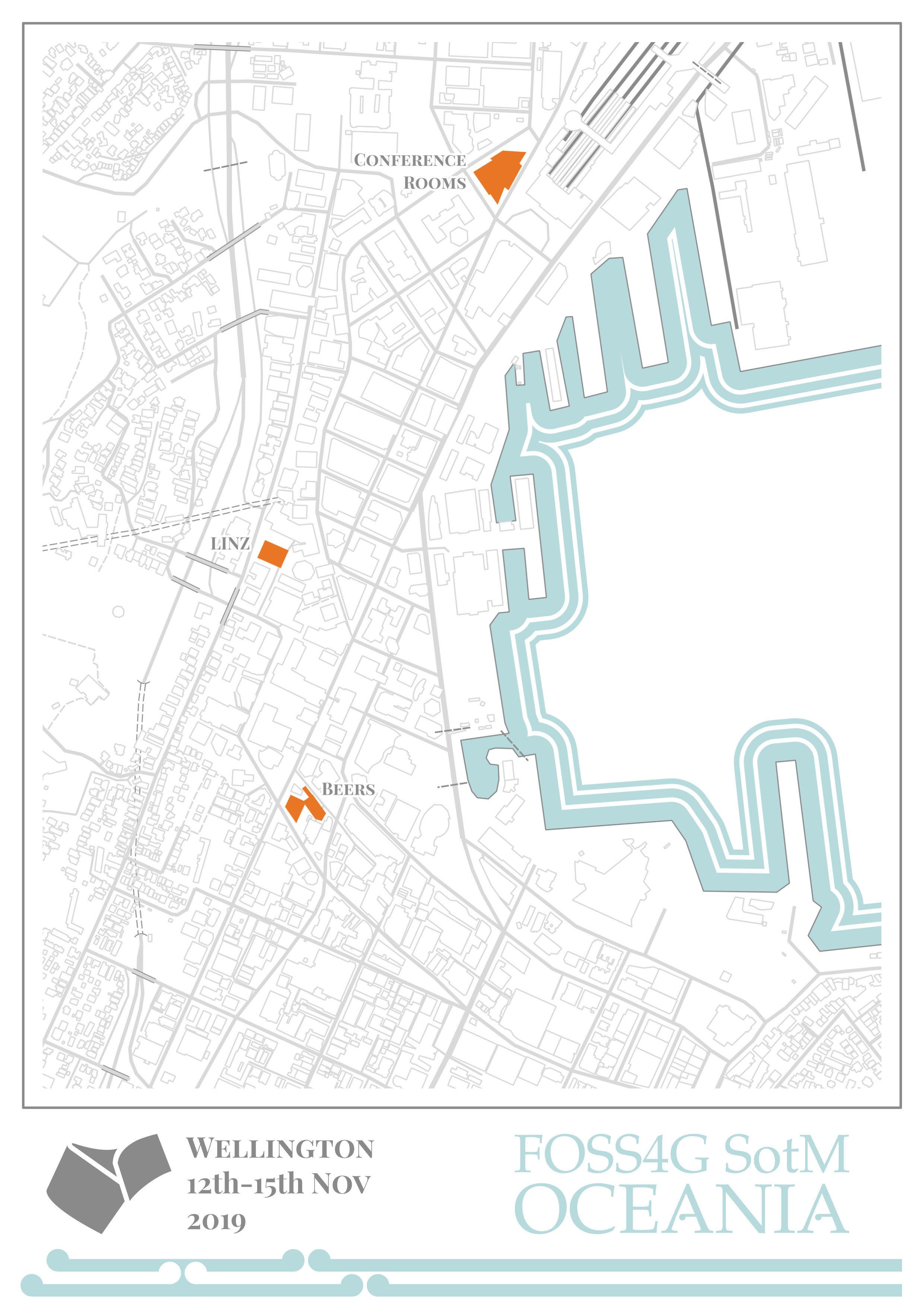
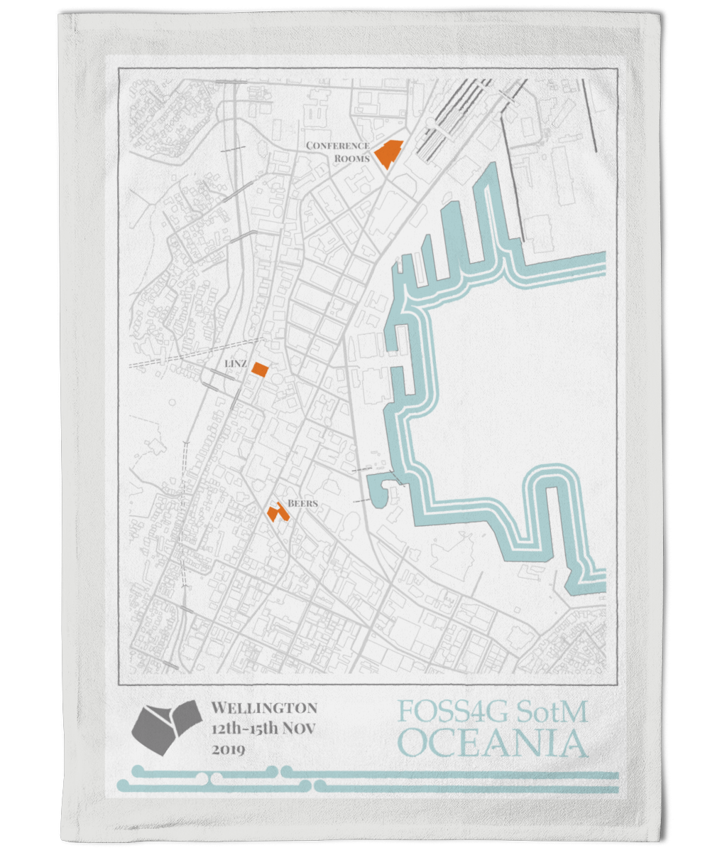
This design is inspired by the NSMS 13 series maps from the 1920s with their beautiful coastline symbology, and Gordon Walters minimalistic Koru design. And it has a tea towel design! Sorry, I'm obviously still trying to make a name as a tea towel designer.
-- Entry by Pete King, 11:15, 9 Mar 2019 (UTC)
Logo Submission by Rebecca Clarke
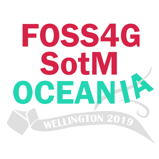
A playful take on windy Wellington, so did it blow you away?
-- Entry by Rebecca Clarke, 07:33, 10 Mar 2019 (UTC)
