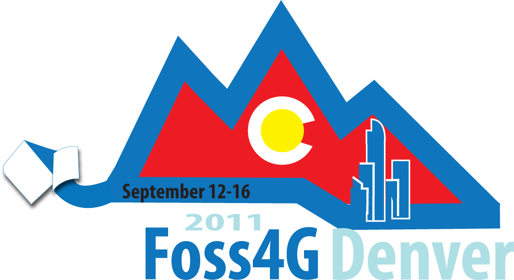
Difference between revisions of "FOSS4G 2011 Logo"
Jump to navigation
Jump to search
Wiki-Pmbatty (talk | contribs) |
Wiki-Pmbatty (talk | contribs) |
||
| Line 25: | Line 25: | ||
== Please add your comments here! == | == Please add your comments here! == | ||
| − | Personally I like the idea of something that is similar to the Sydney and Cape Town logos, which incorporate the ribbon as a more central theme, and depict the Rocky Mountains across the top. You can see these logos [[http://foss4g.org/static/index.html here]]. The GITA design is along these lines, but personally I'd like to see a few more options on that idea, perhaps from Steve's designer to get some variety. | + | From Peter: Personally I like the idea of something that is similar to the Sydney and Cape Town logos, which incorporate the ribbon as a more central theme, and depict the Rocky Mountains across the top. You can see these logos [[http://foss4g.org/static/index.html here]]. The GITA design is along these lines, but personally I'd like to see a few more options on that idea, perhaps from Steve's designer to get some variety. |
== OSgeo Ribbon == | == OSgeo Ribbon == | ||
Revision as of 15:52, 18 October 2010
NOTE: These are all concepts... the final idea may be reworked by a real graphic designer!
Please add your comments here!
From Peter: Personally I like the idea of something that is similar to the Sydney and Cape Town logos, which incorporate the ribbon as a more central theme, and depict the Rocky Mountains across the top. You can see these logos [here]. The GITA design is along these lines, but personally I'd like to see a few more options on that idea, perhaps from Steve's designer to get some variety.
OSgeo Ribbon
Note: The final logos must have the OSgeo Ribbon integrated
Original Files
Concept1 (opens in Google Docs)
Concept2 (opens in Google Docs)
Ribbon Concept 3 (opens in Google Docs)
SteveC's ideas: File:SteveC-Logo.pdf
