Difference between revisions of "Web site design"
| (One intermediate revision by one other user not shown) | |
(No difference)
| |
Latest revision as of 02:11, 5 August 2013
Purposes
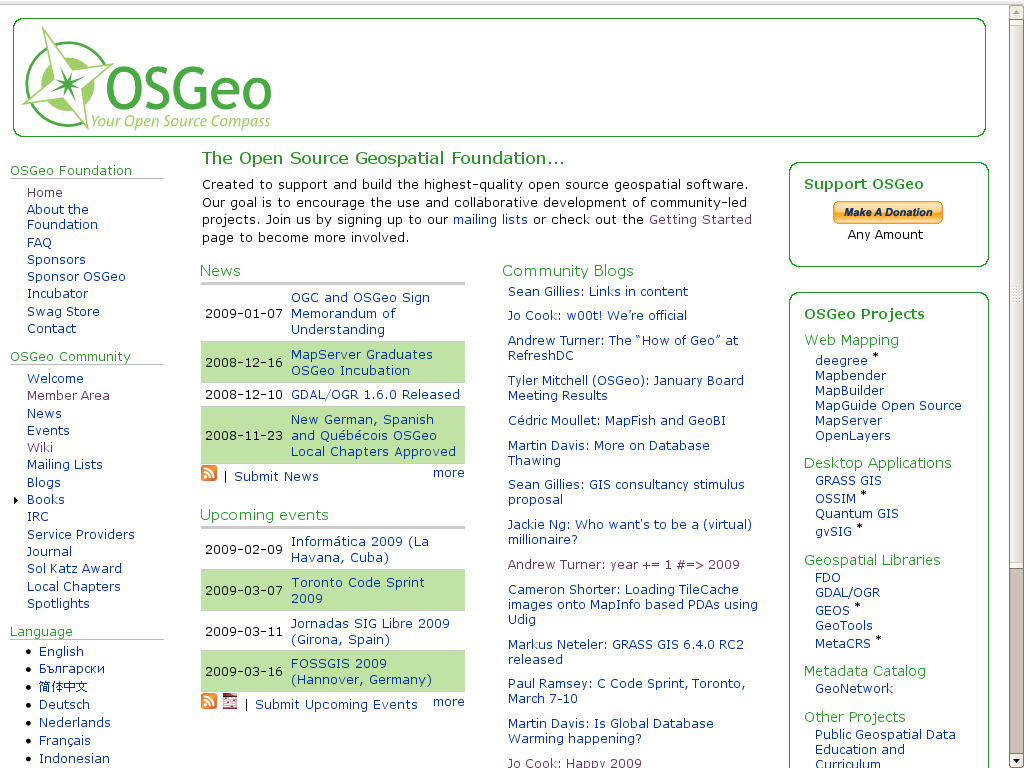
This wiki is the place where the Marketing Comittee of OSGeo is planning the improving the design of the OSGeo Web site following a user-centered design process (UCD).
The reason for redesigning a website is to end up with impact and results, not because there are those bored with the design or because some users want it to be blue not red. It is important to focus on the results we want.
Example, the Amazon website has had very little change for over 10 years. Why? Because it works!
More visitors, leads, contributors and sponsors is the primary goal. Every decision made should be focused on improving this. Keeping that in mind, we might spend a bit less time worrying about the exact shade of blueish-green on the call out background, and more time worrying about things that will improve our marketing results.
It is important to analyze what are the assets we have, analyze the website and evaluate what can be improved
Goal
Increase Traffic and Leads
Secondary Goals
- increased usability of the OSGeo Web site, and
- increased use of the resources on the OSGeo Web site due to better usability.
- aligning site branding with an official print design
Members
- Tyler
- Daniele
- Jeroen
Tasks
1) Analysis of the Current website
- Content Design
- Layout Design
- Navigation Design
- Visual Design
1.1) Inventory of OSGeo Website Assets
Assets
- Content
- For New users What is OSGeo, What are the OSGeo Projects
- Case Studies at the first look (case studies available in various places at the moment)
- Educational Material - learn the software.. a course repository started recently. More in wiki.
- General agreement that almost all content on current is worth keeping, though maybe just not in same location or on same site
- Layout
- Navigation
- Visual
E-Marketing Centric Assets
- Links
- Keyword Ranks in Major Search Engines
- KPI's and AWStats data
1.2) Define areas that need improvement
These are a few comments from some of the Marketing Committee participants
- Content - Content drives visitors, search engines like content, websites with more content have more traffic' ' (Volt, M. 2008)
- More
- What is OSGeo, * What are the OSGeo Projects, * How is using an OSGeo project giong to help me
- Some of the written content could be summarized
- The site is very static and rigid. The community lives somewhere else. Do we want a more active site?
- Alter and restructure the "About the Foundation" and "FAQ" materials (w)
- Focus on intro and overview material
- Layout
- Navigation
- Language selection could be made better
- o The navigation menu is not the correct place to put language selection in.
- A alternative way could be to have a "change language" link in the top banner somewhere, which would take the user to a page like this.
- The Login section is not easy to find on the homepage
- We have a very long menu. It should be shortened.
- We should implement a search. Probably google site search.
- Having a dump of our current site map would help show what we have already for content
- Visual
- More images may make the website a bit more friendly
- The site could use more color.
Projects
Ideas
- Content - Outstanding Content!
- User centered Design
- User testing
- Usability
- Tied to branding of print material
- Make a clear break between outward focused informational site and an inward community site. Two different instances.
Links
- 10 tips for a usable website
- Book: Web Design for Return on Investment
- Flag as a symbol of language - stupidity or insult?
Previous discussion
- Several emails following from this marketing thread and this board thread
- Target audiences and messaging are discussed in the Marketing Communication Strategy 2008 (section 6 in particular)
- WebCom OSGeo Site Focus presents various target audiences as well under Marketing Targets
